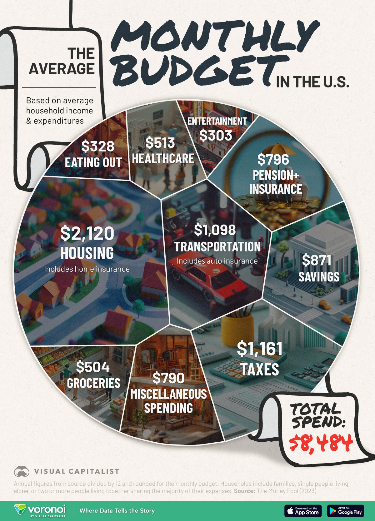
This chart shows what the average U.S. household budget looks like by tracking where all income goes to, including expenditures, savings, and taxes.The data comes from The Motley Fool, with annual figures for 2023 converted to monthly spending.
pull down to refresh
related posts
90 sats \ 0 replies \ @freetx 10 Jan
sad state of affairs...
reply
38 sats \ 1 reply \ @SimpleStacker 10 Jan
I'd be much more interested in the median than the average. For these statistics, the average is only useful as a mathematical convenience (total = average*#units). But the median gives you a much better sense of how the typical person lives.
reply
30 sats \ 0 replies \ @Bell_curve 10 Jan
average looks too high anyway
from the article:
For context, median household income for that same year stood at $80,610, about $20,000 lower than the average.
reply
21 sats \ 4 replies \ @Bell_curve 10 Jan
The average seems high for a month
average household income is $101k per year?
reply
13 sats \ 0 replies \ @Longtermwizard 10 Jan
That's a lot of money!
reply
0 sats \ 2 replies \ @jakoyoh629 OP 10 Jan
reply
13 sats \ 1 reply \ @Longtermwizard 10 Jan
That's still a lot of money man.
reply
0 sats \ 0 replies \ @Bell_curve 10 Jan
these averages are not interesting because they don't tell us anything valuable
something more useful would be average or median retirement savings by age 59.5
average or median wealth or net worth
reply
0 sats \ 0 replies \ @Aardvark 10 Jan
Where's the big slice of pie that says bitcoin?
reply
0 sats \ 1 reply \ @nym 10 Jan
I know a lot of folks that spend a lot more than that on groceries.
reply
10 sats \ 0 replies \ @realBitcoinDog 10 Jan
Where is the Coke Zero budget?
reply